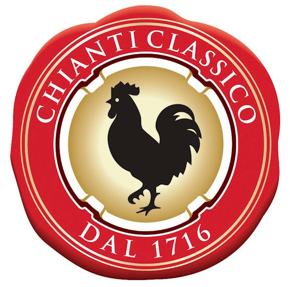
On 19 February 2013, as part of a new marketing push, the
Consorzio Vino Chianti Classico released the new Chianti Classico wine logo, a modified version of the famous
black rooster (gallo nero) symbol of Chianti with a border changed from the bright red to a purplish colour, presumably meant to evoke the colour of wine, even though sangiovese ("blood of Jove") grapes produce a characteristically red-coloured wine. The most frequent use of this Chianti Classico logo is on the numbered paper seal over the capsule of a bottle of Chianti Classico wine that provides a guarantee that the wine is what it claims to be.
 |
| The new Chianti Classico wine logo. |
I find the new black rooster silhouette as good as the old one but regret the loss of the very recognisable and attractive bright red border. I realise there's some symbolism in the new border colour but, next to the dull green used on plain package cigarettes in Australia, purple is said by psychologists to be the most off-putting colour for marketing and I can see why they say that. The new background seems to represent the rays of the rising sun, which makes sense for a more aggressive, crowing cockerel, but seems less warm to me than the golden background.
 |
| The previous Chianti Classico wine logo. |
The new logo and marketing seem to be in part a reaction to the ruinous loss by the Consorzio in its trademark court battle against the litiginous Gallo Brothers, the largest wine producers in the USA. The Consorzio not only lost the case but had to pay costs, and the gallo nero rooster cannot be used on Chianti wines sold in the USA.
Part of the new marketing strategy involves redefining the rules for Chianti Classico wines and adding a new wine category above the Riserva level. I'll be posting on that
soon.
More about Chianti Classico wine.
More about Gallo Nero wines.
Author: Anna Maria Baldini

